
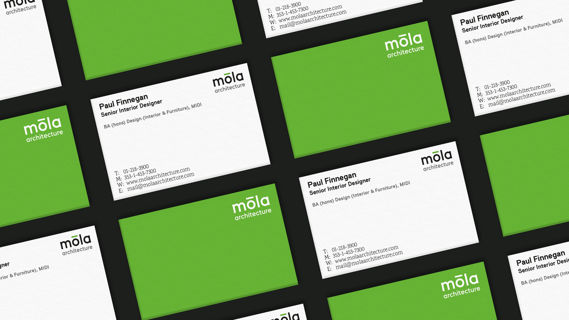

móla architecture is an internationally recognised architecture firm that approached me to update their old logo and make it more suitable to the newer digital and social mediums. Not wanting to stray too far from the original brand I took the logo and compressed it by stacking the "móla" on top of the "architecture" this also gave the logo a better sense of hierarchy. This was then complemented with a change of typeface that was modern, geometric and feels like it was built by architects. Not wanting to loose the divide in the I turned the fada above the "o" green. That element of the fada can be used as an icon element when the logo is scaled down too far to be legible.